Judge a product color from several kinds of photographs
Product photographs can shift with lighting, editing and your screen. Use several kinds of evidence to narrow the uncertainty before buying a color-sensitive item.
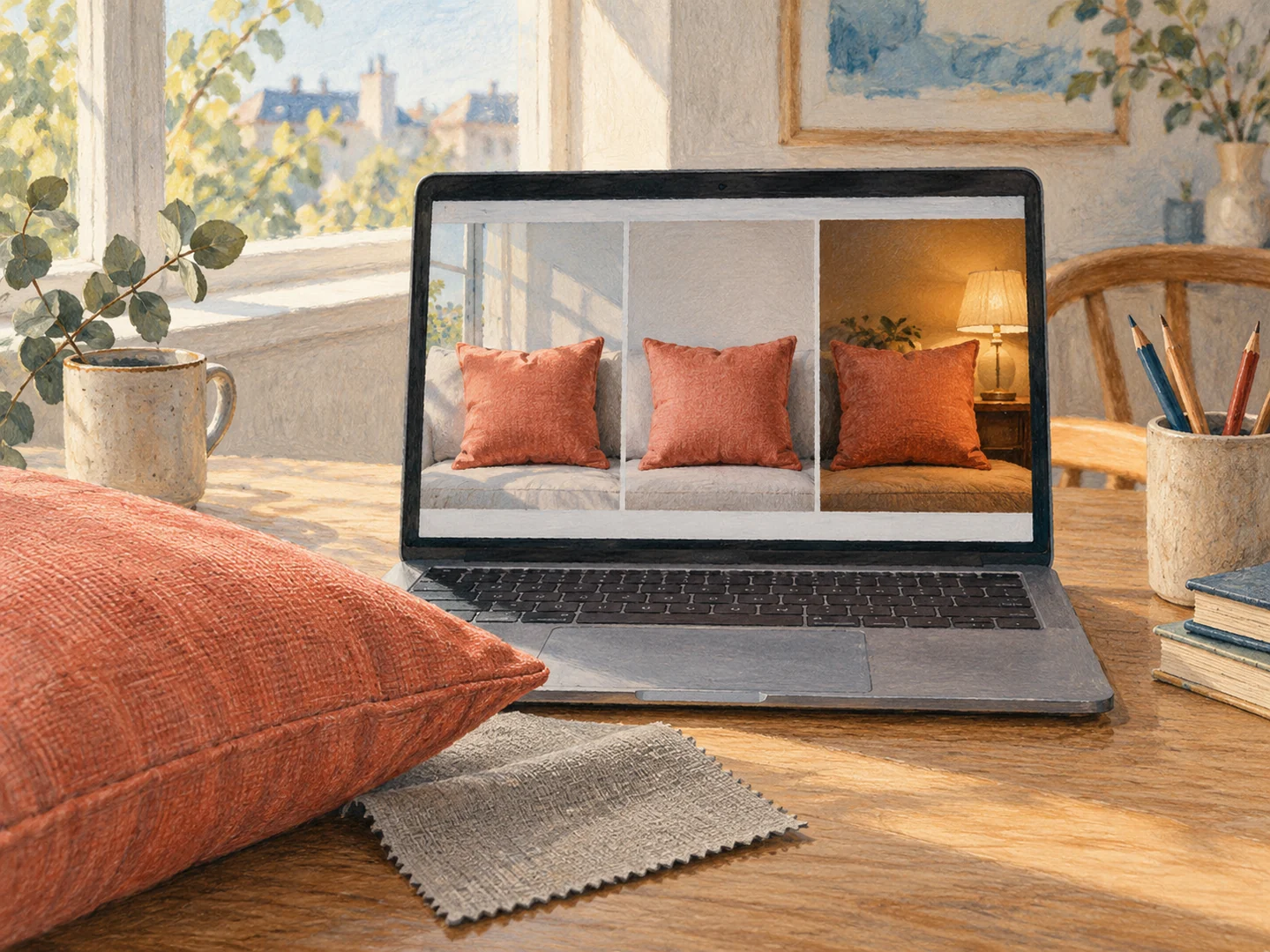
A beige cushion can look pink in one photograph and gray in the next. That does not necessarily mean the product has changed. Light, surrounding colors, camera settings and screen display all influence the image. Treat the photographs as clues rather than a precise paint chip, particularly when the item needs to sit beside an existing fabric.
Find views that answer different questions
Look for a close-up of the material, a full product image and a photograph in a room. The close-up helps with texture, the isolated view shows the overall shape, and the room view suggests how the color behaves beside other objects. None is definitive alone. Several identical studio angles provide less useful variety than genuinely different lighting conditions.
Customer photographs can add context, but they have their own limitations. A warm evening bulb or a phone filter can distort color just as much as a studio setup. Look for recurring observations across several images rather than choosing the single photograph that most closely matches what you hope the item will look like.
Check that each photograph shows the selected colorway. Listings with many options sometimes keep a lifestyle image visible after another color is selected. Read captions and image labels, and compare the product code if one is given. A cream room photograph should not quietly become evidence for the pale-gray version in your cart.
Notice what the surrounding room is doing
A white cushion photographed beside a red wall can pick up reflected warmth; the same cushion beside a cool window may look different. Your own room has those influences too. Before ordering, look at the nearby floor, wall and large furniture surfaces. A sample should be held beside them, not evaluated in isolation on a bright white desk in another room.
Consider scale as well. A small swatch of a strong color can feel lively and manageable, while the same color across long curtains becomes a much larger presence. Fold a blanket or place a larger sheet in a roughly similar color at the proposed location to explore the amount of color, while remembering that it is not a precise match. This separates two questions: whether you like the hue and whether you want that much of it.
For a pair of items bought separately, check whether both are from the same colorway or production range where the maker provides that information. Natural materials and manufacturing batches can vary. If close consistency matters, ask the seller what variation is expected and whether a matching pair can be supplied. If variation is acceptable, leave room for it in the design instead of arranging two almost identical surfaces side by side where every difference becomes the focus.
Use words carefully
Color names are not standards. Oatmeal, stone, ivory and natural can refer to a wide range of shades. Read descriptions of undertones when available, but do not assume that two brands using the same name will match. A material's texture can also affect the impression: a glossy surface and a rough weave may look different even when their underlying hues are similar.
Suppose you are choosing a throw for a warm tan sofa. You may not need an exact tan match. A clearly different cream, rust or muted blue could create a more deliberate relationship than a nearly matching beige whose undertone clashes in daylight. Deciding whether you need a match or a companion color can reduce the pressure on an online photograph to be perfectly accurate.
Bring a sample into the room when possible
For curtains, upholstery and larger purchases, request a swatch if offered. Place it beside the existing materials and look at it during the day and under the lamps used at night. A small swatch will not show the full impact of a large area, but it can reveal an undertone that a screen hides.
For a smaller item without samples, read the return policy before ordering. Keep packaging until you have viewed the item in its intended location under ordinary lighting. Do not remove labels or alter it before understanding the return conditions. If an exact match is essential and no reliable sample exists, buying in person may be the less frustrating route.
Adjusting your screen brightness can make viewing more comfortable, but it cannot turn every product image into a calibrated color reference. Avoid endless comparisons between tiny thumbnails. Gather a few different views, decide how much variation the room can tolerate, then make the purchase only if that remaining uncertainty is acceptable.